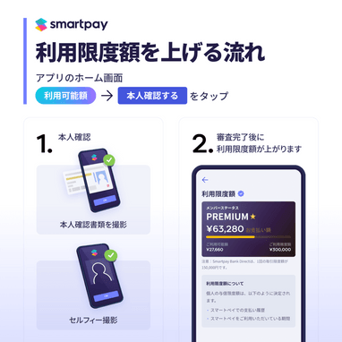
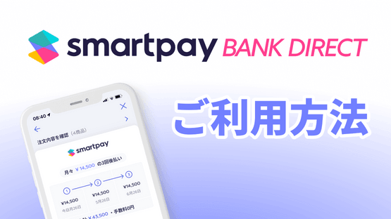
Smartpay Brand Guidelines
Welcome to the Smartpay Brand Guidelines. This document serves as a reference for all official communications and materials associated with our brand. Our guidelines provide a clear and consistent understanding of how to use our logo, colors, imagery, and messaging to effectively represent our brand. By adhering to these guidelines, we ensure that our brand is represented consistently and effectively across all mediums.
We encourage you to read through these guidelines in full and refer to them when creating any materials associated with our brand.
Guide Index
Using Smartpay in Text
When using the word “Smartpay” on text, please write it only with the first capital letter. Other variations or splitting the word in two, they are not allowed. The only exception to include our logo in text is using our product OSM. When the entire paragraph is capitalized, the Smartpay text could be all caps.
Smartpay Logo
When you reference Smartpay on your site, please follow these logo guidelines.
Smartpay Logotype
There are six Smartpay logotype color variations for you to choose from:
- full-color on white, full-color on dark
- solid dark on white, and solid white on dark.
- line dark on white, and line white on dark.
We recommend using the full color version whenever possible. The monochrome logo should be used if colors are limited or you've been asked for a single color logo.
Vertical
The vertical version is used for square and vertical layout formats. For example for printing typographic products, t-shirts, advertising banners, instant messengers, social networks, signboards.
Smartpay Symbol
We recommend using the full color version whenever possible. The monochrome logo should be used if colors are limited or you've been asked for a single color logo.
Download Logo Assets
Smartpay logo assets can be downloaded from below. Logo assets includes SVG and PNG formats for digital display and EPS format for printing. Please use the suitable asset for each use.
Clear Space and Exclusion Zone
The recommended clear space must never be reduced, but can be increased.



Color Palette
Color helps creating a cohesive brand by developing a consistent look and feel. The nicknames of the colors will come in handy when specifying colors to someone by email or over the telephone (provided they have a copy of these guidelines handy)
Blackberry
- HEX# 231C45
- RGB32 28 69
- CMYK95 95 40 75
Turquoise
- HEX# 00D5E0
- RGB0 213 224
- CMYK92 0 12 0
Light Sea Green
- HEX# 2DB2B2
- RGB45 178 178
- CMYK90 34 40 0
Very Light Blue
- HEX# 7280FF
- RGB114 128 255
- CMYK78 48 2 0
Wild Strawberry
- HEX# FF3F8F
- RGB255 63 143
- CMYK0 80 28 0
Amber
- HEX# FFC000
- RGB255 19 0
- CMYK0 25 100 0
Download Colors Swatches
RGB and CMYK color swatches are available to be downloaded in Adobe Swatch Exchange format. Accesible from the swatches panel from Adobe Photoshop and Adobe Illustrator.
Minimum Sizes
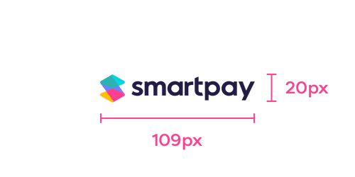
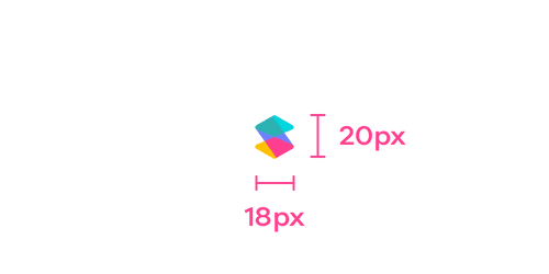
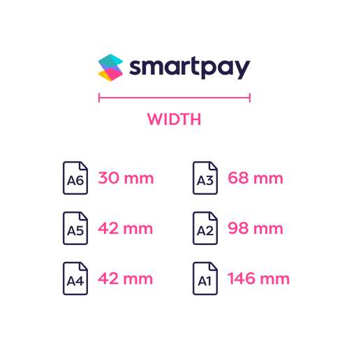
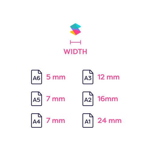
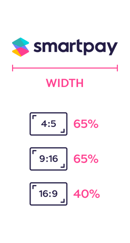
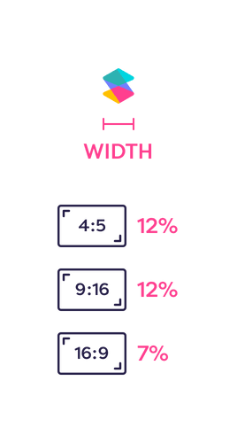
When you reference Smartpay on your site, please ensure that the Smartpay logotype and icon are no smaller than the following sizes:
Digital ![]()
![]()
Print ![]()
![]()
Video ![]()
![]()
Smartpay Brand Collaboration
The recommended clear space must never be reduced, but can be increased.

Download Brand Collaboration Template
Download the Adobe Illustrator template for digital or print from here:
Logo & Symbol Misuse
Our logo and symbol are crucial to our brand identity and how we present ourselves to the public. It is vital that we handle these brand elements with care. There are specific rules to follow when using our logo, and following these guidelines helps preserve the consistency of our brand.
Thank you for considering the importance of our brand.
Do not change the proportion ![]()
Do not change the orientation ![]()
Do not outline ![]()
Do not use colors not specified ![]()
Do not add shadows or effects ![]()
Do not mirror ![]()
Do not decorate ![]()
Do not use in text ![]()
Do not hide it ![]()
Do not rearrange elements of the logo ![]()
Do not add an outline ![]()
Do not break the clear space rules ![]()
Do not place it in a non solid backgroud ![]()
Do not place it on a busy image or pattern ![]()
Do not ignore color contrast ![]()
App Screenshots
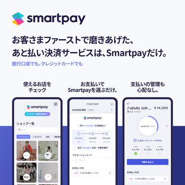
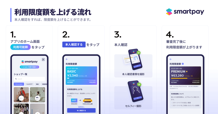
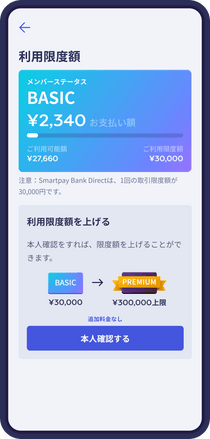
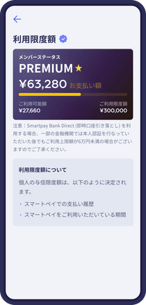
We recommend you to to use these screens to show how our app works. We will increase the screens when we introduce new features. Do not modify the content of these screens or mix them up with your own.
If you want to show how to use our app, please use the videos linked below.
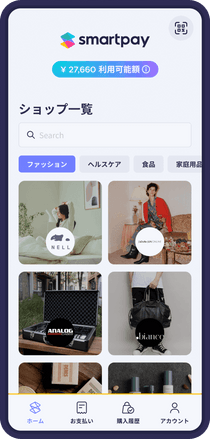
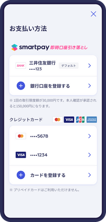
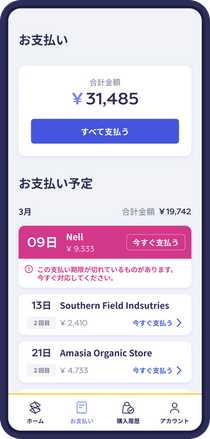
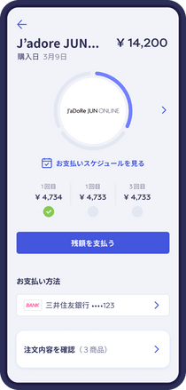
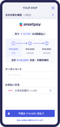
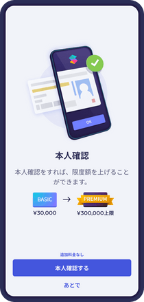
Download Smartpay Product Image Kit
We prepared a bundle of the most important screens from our product in Hi-resolution PNG format ready to be use.
Banners
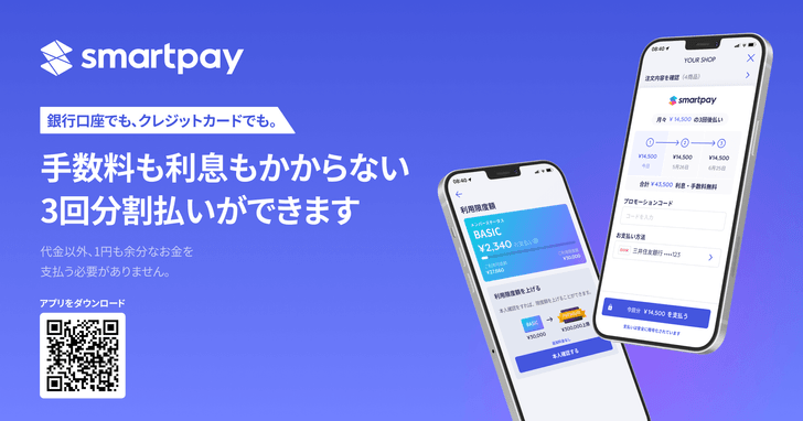
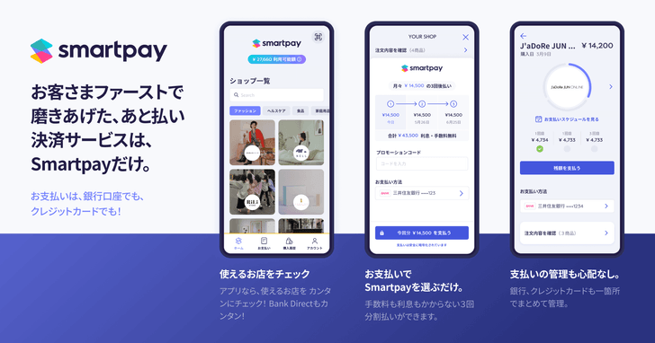
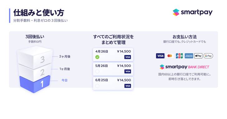
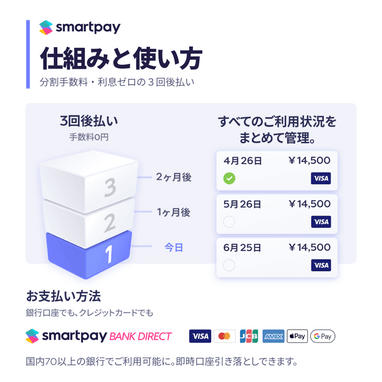
We prepared some banners for your site and social networks to talk to your audience about us. These are ratio fixed, but you can always use our responsive banner.
Download Banners Kit
Videos
We hosted some videos on our Smartpay Youtube Channel to make it easy to setup new accounts and the first payment method. Please link them or embed them in your website.
- How to use Smartpay
![]()
- How to use Smartpay Bank Direct
![]()
